Assessment 2: The Week That Was

Most people would agree that different days across the week have a feeling that follows a repetitious pattern that repeats with each week that goes by. This emotional wavelength that many of us experience was the inspiration for my narrative, and so I was drawn to the phrase; the week that was. Conveying the emotional journey experienced throughout a typical uneventful week was, an arguably more abstract interpretation of my phrase, and it certainly did not make the narrative aspect of the task any easier. Choosing to convey a non-linear narrative was certainly more of a challenge than I initially anticipated. As I did not set out to capture a consistent and planned colour palette, artificial lighting nor strict composition in each image, I believe that what binds the photo series together is the candid depiction of fluctuating emotions throughout.

I felt that due to the vision I had for my theme, any staged posing or artificial lighting would have contradicted and shrouded the tone of the everyday emotional journey which I wanted to capture. Whilst on the surface, using natural lighting seems like less effort; I found this not to be the case. Working around the different coloured light across the span of a day in addition to the changeable weather was more time consuming than I anticipated. However, I was committed to utilising natural light at different times of the day to best capture the mood of each image, and am now pleased that the effort of doing so has paid off. I feel that the natural lighting has added to the subtlety that I set out to achieve across my photoseries. Some images were taken in a Rembrandt style with natural light streaming through a window. Although this did not have the stark effect that is typical of staged Rembrandt lighting, it felt appropriate in the images in which it was used (1, 4 and 8).

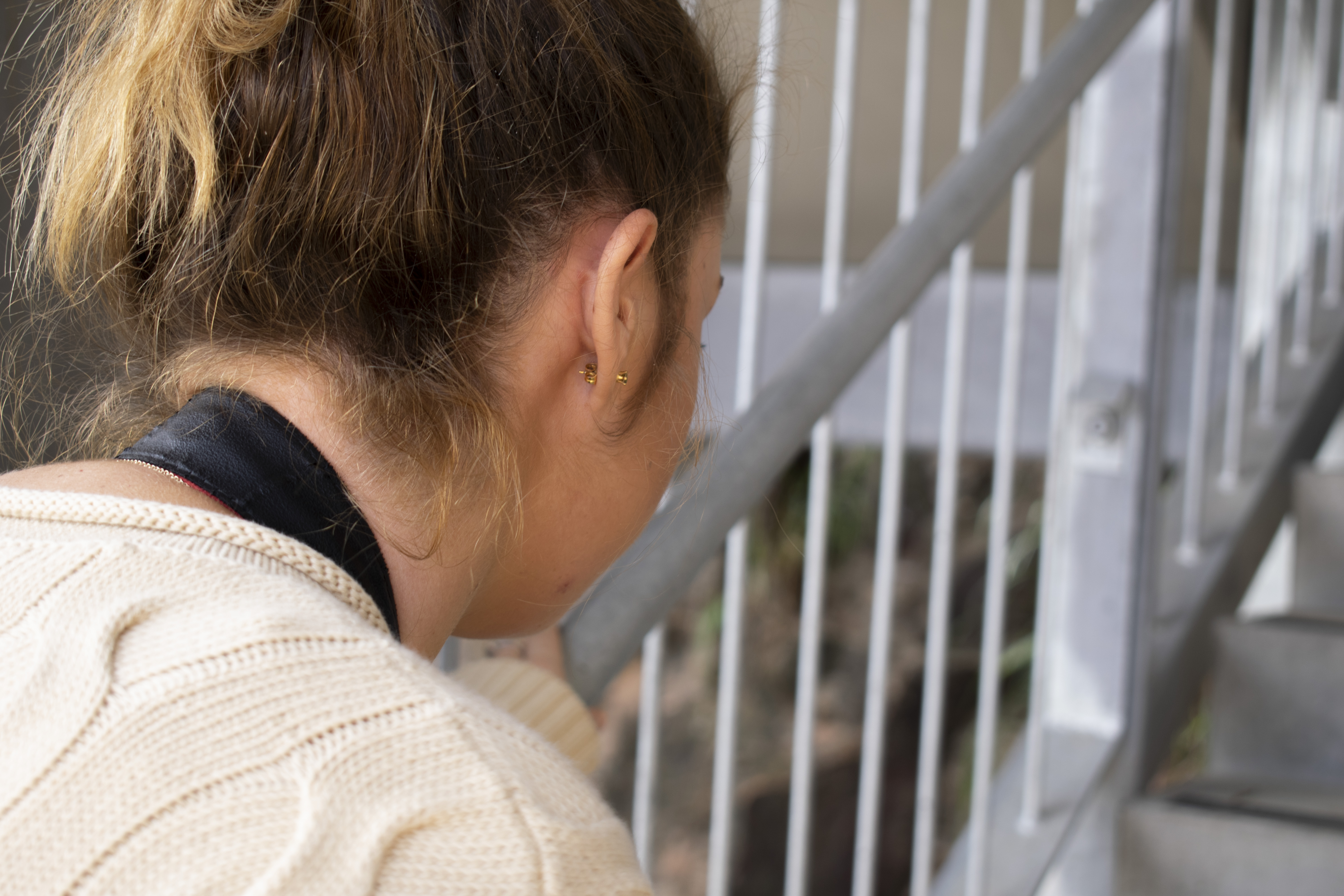
To reinforce the emotional journey within my theme, I shot all of my images with a narrow aperture ranging between f/3.5 and f/4.0. I felt that this was important to draw focus to the human subject of the images, specifically the emotion he displays both in his body and facial expressions. This was also important because I was determined to not heavily stage each photo, which meant capturing these exampled of emotion naturally.

I did not want to produce a photo series that felt too literal. Therefore, rather, than setting out to capture an image to convey each day in the week, I wanted to depict the feelings that we experience from Monday to Sunday without taking solely portrait images. I believe that the order in which I put my images also helped to achieve this, by cycling between the morning coffee and work, I hope to garner an empathetical response from the viewer. This mood should lighten towards the end of the series as we come to the emotions of the weekend. 

The final image is taken as the weekend has drawn to an end and the subject is right back in the same room where the images started, looking to the window where he drinks his morning coffee. The mixed emotion on his face feels relatable for a Sunday afternoon; anticipating the week that is to come.

f/3.5; ISO 200; 1/100s
f/3.8; ISO200; 1/100s
f/4; ISO200; 1/100s
f/3.5; ISO200; 1/100s
f/4.8; ISO200; 1/100s
f/3.8; ISO200; 1/100s
f/4; ISO200; 1/100s
f/4; ISO200; 1/100s

Week 11: Printing

Prior to printing an image, there are several factors that should be considered.  Image dimensions Resolution Colour profile Image format (usually either high quality JPEG or TIFF) The gamut of the colours in the printer to ensure it can print the colours in your image.
You can purchase a colour calibrator which will compare the colours on a monitor to the colours on a test print. This will give you a colour profile for a specific printer and computer. Using this prior to printing your images ensures that the colours are as accurate as possible; thus avoiding printing the same image multiple times to produce the desired outcome. 

What to do with the colour profile created by this process: Computer > Profiles> Colour Sync
Drag and drop the colour profile created by the calibrator program into this section of your computer.

To avoid your image being cropped when printed: Image > canvas size
This increases the canvas size from the centre outwards. Adding a few centimetres to the canvas around the image means that you are less likely to loose any of the photo itself when printing due to the size of the paper. This way it will have a white border, which is preferable to a cut-off image.

In preferences, transparency and gamut you may need to change the Gamut Warning – it is best that you select a colour that is not in the image that you are printing. This should further ensure

Soft Proofing
Customise Proof Condition > Device to Simulate > Select the colour profile that you have saved earlier (generated by calibrator program)

Colour Gamut: To ascertain if there are any colours that cannot be printed on the image itself, select View > Gamut Warning
In order to bring any colour warnings back into Gamut we can use an adjustment layer. This may either be HSL or Curves. In Photoshop you can add a new adjustment layer and chose to either modify the colours showing in the Gamut Warming. It is important that this is done to avoid having to print an image multiple times to correct the colour issue. If the issue is not easily corrected you can try adding multiple adjustment layers and/or using an adjustment brush to manually and selectively change (desaturating, brightening or darkening) the colours that are showing in the warning.

Printing: Colour Handling >Photoshop
In the printing window, you should ensure that the colours are being managed by Photoshop rather than the printer so as to keep all of your changes made in the previous steps (Gamut and Colour profile).


After the lesson I felt overloaded with information, but I think its best that I have it documented here in the blog for me to refer back to later – as I’m sure I wont remember it all accurately.

Week 10: Portraiture

Visually highlighting the distortion when using different focal lengths

When taking portrait images, there are 3 main technical points that need to be considered with the camera;

Shutter speed (using the reciprocal rule)

Focal length (ideally long; 85 to 135mm)
Having a longer focal length is ideal for portrait photos as it does not distort the subjects’ facial features, particularly the nose.

Aperture (ideally wide)
The main thing to remember when using a narrow aperture is ensuring that you have focused on the right part of the face; the eyes rather than the nose. This will be noticeable when reviewing images later if the eyes rather than the nose are in focus.

The background is also an important aspect of portrait photography. Whist this is also dependant on the creative effect you are trying to convey, it is integral in portrait images to not have a background that distracts from the subject as this will often defeat the purpose of capturing this kind of image. Thus, generally, the simpler the background; the better.

Portrait Lighting
The direction, colour, brightness and quality of the lighting will also need to be considered and staged appropriately. Additionally, choosing hard or soft lighting will made a difference to the kind of image you are trying to capture. This is greatly dependant on the mood of the portrait. For example, lighting a subject straight on is going to be for more beauty shots, whereas lighting side on can be more dramatic as it shows more depth and texture. There are multiple lighting options that may be used alone or in conjunction with each other to create different effects;

Main/key light; sits in front of the subject at or above a 45 degree angle.
Fill light; smaller and farther away than a main light.
Hair light; adds detail and shine to the hair (useful with a dark haired model against a dark background).
Background light; separates subject from the background. Can be done as a necessity, or to add depth to the image.
Accent light/s; either behind or beside the subject as required.

Additionally, these lights can also be used along with modifiers such as reflectors, grids, barn doors, scrims, umbrellas, soft boxes and beauty dishes.

Practical Activity
This week we experimented with taking portrait images with different kinds of artificial lighting.

We also played around with using a light stick on a slower shutter speed and a flash. This way we could capture the model’s face and with the flash at first, then capture the light trails with the light stick around her.

Week 9: Narrative Photography

Narrative photography is basically visual storytelling. This can take the form of either a singular photo, or a series of images. Photo essays can either be a linear or non-linear narrative. The difference between the two being that a linear story has a clear beginning middle or end, often chronologically. Creating a photographic essay entails finding a subject, researching the story and deciding on the specific images you want to take. Becoming an expert in what you’re photographing is necessary for framing your narrative so that you know  your understanding of it is all-encompassing – there could be a perspective on the topic that you’re missing out on! Not doing this could mean you also miss out on some more interesting or in-depth images. Once you have done this, planning out the specific images is integral to the photo series. There are five kinds of images that will often be found in a photoessay which are particularly important to the planning phase. Additionally, having these kinds of shots planned can be helpful when it comes to final image selection after the images are shot:

The first being an establishing shot that introduces the subject and/or locationA portrait, being an image of your subject within a scene
Action/process shots, showing the subject doing something pertinent to the narrative
A detail shot, adding a close up image of something relevant to the story
The final is the closing shot, which should wind-up a narrative, or feel like the final piece of the puzzle

Practical Activity
This week we had to put our knowledge of narrative photography to the test by capturing a quick photoessay during class time. I decided on the very simple narrative of climbing a flight of stairs. As we didn’t have time to sit down and plan out a narrative, the images are loosely based on the shot list which we had just learned about.

(Establishing Shot) f/5; 1/100s; ISO200
(Detail shot) f/4.5; 1/100; ISO200
(Action Shot) f/4.5; 1/100; ISO200
(Action Shot; detail) f/4.5; 1/100; ISO200
(Action Shot) f/4.5; 1/100; ISO200
(Closing Shot) f/4.5; 1/100; ISO200

Although this was a very simple narrative example, I felt that doing so would allow me to focus more on the kinds of shots I would need to frame to tell the story.

Assessment 2 Ideation

For our final photoseries I knew from quite early on that I wanted to work with how colour relates to emotion. As of last weeks’ lesson and activity on light, I found that I really enjoyed working with light and how it affects colour. These two developments have certainly framed my direction and planning for my final series of images.

In researching techniques and looking for inspiration, I created a pinterest board to collect images to further frame the direction of my narrative series.

https://www.pinterest.com.au/brionytherese95/asmt-2-colour-photoseries-inspiration/

An emotional journey

Communicating the emotional journey: Long Exposure Idea
Colour and Light Concept Ideas

Understanding that we will be depicting a narrative across each shot in our images, I wanted to look into conveying an emotional journey. However, being that there are many kinds of emotional journeys people experience across a lifetime, narrowing it down to one for this assessment has become a journey in and of itself.

With any ideation, I find a great place to start is with a good ol’ fashioned brainstorm. My ideas culminated in a mixture of both quite deep and lighthearted ideas – which has certainly not helped me narrow down my choices. However, I did find myself gravitating towards the more mundane regular emotional journeys that people experience. In my mind, these final few ideas could lend themselves to either human models, or toys. As I was initially so focused on selecting a topic and phrase, I hadn’t foreseen that choosing the subject of my images would be an equally time consuming aspect of my planning phase.

At this point, my theme ideation came down to two options that appealed to me. I decided to compare my current thoughts surrounding each theme on paper; doing so meant that I could evaluate what ideas I had for bot and decide on a topic. After doing so, I found that one idea clearly had more creative staying power than the other and have, therefore, chosen to centre my colour photoseries around the emotional journey of a week. The exact phrase is likely to need some fine tuning as this feels too long to use for this task – but you get the idea (any changes to the wording of this phrase will be updated on the blog).

Test Shots
I have taken the following images to test the light in the morning sun where I will be taking some of my photos for this shoot. I found that I preferred to use the Shade white balance setting to show the warmth of the morning sun in the area. However, this may change with the model and to convey the accurate mood and tone of certain days of the week (eg. Monday compared to Saturday or Sunday). At this stage, I think this setting is ideal for Friday, Saturday and Sunday, however for other days of the week I am likely to use the Daylight WB setting.

Using my own hand to test my aperture and light, (although it looks a bit strange) I found certain angles and areas of the house that I wanted to shoot.

The lighting in this area of my house has some great soft natural lighting that I would light to utilise in my images.

At this stage I am looking at doing 5 final shots to convey Monday, Wednesday, Friday, Saturday and Sunday. This was because Tuesday and Thursday I don’t believe that they have any specific qualities that separate them from other days of the week for the purpose of my photoseries.
The thumbnail sketches I have above give an idea of the kinds of angles and shots that I will be looking to capture, but this is subject to change based on the lighting on the days I shoot.
Fortunately as I will be taking photos in my home of my partner, I can work around the weather, as it has been very rainy lately and this affects the light that I want to capture. Therefore I don’t have any set shoot-dates, however I want to have them completed by the middle of week 11 at the latest.

Final Phrase: the week that was

Week 8: Light

This week our focus is drawn to learning about natural and artificial light as the most integral aspect of photography. This means to be able to photograph it as well as seeing and understand it with the naked eye.

Natural Light
This refers to all variations of light from the sun, which is certainly also weather-dependant. As a larger light-source, natural light can be both soft and strong enough for a diverse range of subjects from portraiture to landscape photography. Whilst useful, its changeable nature means that it can also be difficult to harness, and can only be fixed in post production.

Artificial Light
Basically describes any man-made light which is usually either categorised as a flash/strobe or continuous light. The difference between the two is as such: Strobe lighting comes in a very diverse range of sizes and is thus either portable or stationary. Either way, they are extremely  powerful but are far more expensive. They assist in capturing clear action shots as the flash is synched with the shutter speed of 
Continuous, as the name describes, is any lighting that remains on before, during and after a shot is taken. The benefits of this kind of lighting is that it is very easy to modify as you can see what you are doing whilst you do it, whether this be adding attachments or just moving it around a subject. This also allows for very different creative effects such as a more cinematic look, or capturing softly blurring motion.  Additionally, importantly they are more affordable than strobe lighting.

Practical Activity
This weeks activity was comparing artificial and natural lighting. I really enjoyed seeking out natural lighting because of how unpredictable it was. It felt like more of a challenge to find beauty in the natural light whilst it moved and changed. I took the following images at the end of the day as the sun was going down with flash and without to highlight the difference between the two. Clearly there are situations in which artificial lighting is ideal, however for most of my comparisons I definitely preferred natural sunlight rather than the flash.

The following are images were taken to further explore natural lighting outside and how it translated into a photo particularly for assessment 2. This also helped me to recognise how light acts in my eyes vs. through the camera lens before taking images for my final narrative photoseries.

Week 7: Colour and White Balance

Whilst the naked eye automatically adjusts and adapts to different lights, cameras often do not do this as accurately. This is because they have a digital sensor which is affected by the colour casts in different lighting environments. Thus meaning that in order to achieve an accurate adjustment, the photographer must have some knowledge of White Balance. Doing so will impact the how the colours appear within the image. For example, this is particularly important when trying to achieve an accurate, natural and consistent colour balance in a series of photos.

Colour temperature is relative to hue, representing warm or cool colours and measured in Kelvin’s. However, as previously mentioned, sometimes cameras can be confused by certain kinds of light. Shade and incandescent are two of these light conditions. 

Warm light: Incandescent/ tungsten
Cool light: Shade


It is best to shoot RAW, particularly if you aren’t confident with the white balance. However it is best to learn the white balance settings and get this correct in-camera. However, if anything needs editing or correcting, shooting RAW still gives you optimal flexibility later. 

There are three white balance options:  Auto white balance, white balance presets, manual/custom. Automatic usually suffices, however tungsten and shade will often need to be shot in a preset or manual white balance setting.


To ensure I understand the practicality of how my camera responds to these different kinds of light with the different white balance options, we completed an activity comparing them. We also used a grey card to help neutralise the lighting, however I have only developed my understanding of this in post-production.
Using the appropriate preset white balance function for each kind of lighting really highlights just how much the camera can change the colours of an image, particularly in photos of people. By matching the setting to the lighting, the result was often a more pleasant and natural looking image. This is something that I had not previously given any though to, opting to edit the image after the fact – however after this activity, my opinion is well and truely changed.

Full Sun/ Daylight

Shade

Cloudy Sky

Tungsten/ Incandescent Light

Fluorescent Light

Week 5: ISO

ISO is also a tool that bridges the other exposure settings in the triangle reciprocally. Specifically, it refers to the cameras sensitivity to light. Therefore the lower the ISO number; the less sensitive the camera is to light. For example, moving from one ISO stop to the next the sensitivity doubles, but simultaneously halves the required exposure time. 
A higher ISO number makes the sensor more sensitive to light, however it also results in the image being more noisy/grainy, with less contrast. Therefore increasing the ISO can sometimes reduce the quality of the image. The usual key to retaining image quality is to shoot as low ISO number as possible. However in low light environments the ISO will need to be increased either for a creative effect or necessity. Artistically a higher ISO number is often used for more dark or moody scenes, and often in black and white.

Low ISO: ideal for brighter light environments
High ISO: ideal for low light environments

Practical Activity
My camera allows me to shoot images within an ISO range of 100 to 25600. Therefore it was this range that I explored throughout the practical activity this week. Doing so helped me gain an understanding of not only how different ISO numbers effected an image, but also how this was effected by differently lit environments. Additionally, all photos were taken with a shutter speed of 1/60 so that I could see how the camera altered the aperture setting reciprocally as I shot through each ISO number.

Artificial Light
The following shots were taken in an area that was lit by an artificial neon light. The light progresses from clear to more glow-ey and thus more grainy as the ISO settings increase. The light sensitivity of the ISO is very obvious in this series.

Low Light
These images were taken behind a curtain in very low light. From ISO 100 through to 25600, the light sensitivity is very clear. The aperture settings don’t change much throughout the series of shots which shows just how much ISO alone can change an image; particularly when comparing ISO 100 to 25600.

Shade
Similar to the low light shots; the aperture changed very little across the series of images. Again depicting how significantly ISO can affect a shot. Artistically, the negative space created in the lower ISO shots create an interesting creative effect.

Week 4: Aperture

One of the three settings affecting exposure, the aperture function could be likened to the human pupil; the larger the opening; the more light that is let in and vice-versa. The f-stop number refers to how wide the hole is.

Importantly. aperture is the primary tool for adjusting depth of field. The following graphic helps to reinforce how aperture also relates to the depth of field within a setting;

eg. A portrait photo ideally would have an aperture of approximately f1.2 to f3

Whilst this is an important function, there are other aspects of photography which can be used to adjust the focus within a scene when framing a shot;
– Distance between the subject and background
– Distance between camera and the subject
– Focal length: wide angle (distorts), normal or telephoto (compresses)
– Sensor size: predetermined by the lens

The activity this week was about shooting through the F stops to gain an understanding of aperture and how it relates to depth of field practically.I struggled with this activity as my aperture setting on my camera as the other settings were shifting reciprocally in response to not only my manual aperture setting, but also the lighting in the environment. The result was that at some points I was struggling to take photos as my camera would not focus on anything in the shot. Revisiting my images now I can see that many taken outside did not really blur the background, despite the low aperture that I had set. After completing this activity I feel that I still have much to learn when it comes to the reciprocal relationship between exposure settings. This, I believe, is also clear in the shots that I took (including those which did not make it to this blog post).

Above: shooting through F stops f/3.5, f/4.5, f/6.3, f/9

Above: shooting through F stops f/3.5, f/4.5, f/5.6, f/7.1, f/8

The shots above and below were both taken with the same aperture settings, in the same light. Yet they perfectly show my struggle with the camera’s focusing and recognising the depth of field. I found just how delicate the process can be with a variable lens. This meant that I had to take time adjusting my distance from the subject in order to get the depth of field exactly where I wanted it.

Week 3 : Shutter Speed

One of three major components affecting exposure, is  Shutter Speed; the term given to the duration which the shutter is open for. The shutter itself is essentially a curtain in front of the image sensor. This is is measured in fractions of seconds, or whole sections displayed on the camera with the “ symbol.

eg. 1/500 = 1 500th of a second

Slow Shutter Speeds
A slow shutter speed means the image will be brighter as the longer the shutter is open for, the more light is let in. Additionally, the shutter speed controls freezing/blurring of motion. So the slower the speed; the more blurred the image is likely to be. This is often used intentionally to create a photographic effect. A good blurred effect is best achieved with darker lighting, a stable surface (such as a tripod) and a slower shutter speed.

Accidental reasons a blurred image: 
Misfocus
Object movement or 
Camera shake

Camera Shake
In order to avoid camera shake, you can use the reciprocal rule; chose a shutter speed that as larger than the focal length of the camera.
eg. Shooting with a 50ml lens, means you need to shoot at of over 1/50 in order to avoid camera shake. Because I have a variable zoom lens, I will need to refer to the focal length number on my camera lens, and relate this to the denominator of shutter speed figures. 

Fast Shutter Speeds
By limiting the amount of time in which the shutter is open for, there is a higher chance of capturing a still image. This is particularly useful when capturing moving objects. However, given the shutter doesn’t stay open for as long, it does not allow as much light into the image sensor. Thus there can be the issue of producing dark images, which may need to be counteracted using either or both ISO and Aperture exposure settings.

Freezing / Blurring Motion
Images captured of a moving subject showing a fast and slow shutter speed. Despite seeking out a darker spot to take these photos, the latter two images taken with a 4″ shutter speed turned out still quite overexposed. However, this was to be somewhat expected as there was surely a lot of reflected light being taken in by the camera.

The following two images were captured during class with a hand held flash and a slow shutter speed to different capture stages of movement. The effect is both eerie and intriguing. It is an interesting way of exploring freezing motion with light using a slow shutter speed.

Panning
This effect is essentially tracking a moving subject, which I did using with varying shutter speeds. The result shows that the success of this effect is heavily dependant on light, subject speed and distance to the subject.
My panning images did not turn out as clear as I had hoped, possibly because I needed a slightly quicker shutter speed as I was so close to such a quick moving subject.

Zoom Blur
A dated and highly stylised effect resulting from zooming in on a subject using a slower shutter speed. The result had my dog looking very meme-like.
I chose a quick moving subject and stood quite close when taking the following shots, this made some images come out much more blurred than others. By adjusting the shutter speed and making it gradually quicker, there is a clear sweet spot for using the Zoom Blur effect. However, I certainly don’t see myself using it again any time soon.

Light Trails
With the camera mode set to Manual, in class we experimented with using both a hand held flash and phone lights to create shapes in images. All shots were taken in a dark room with shutter speeds of 10”.

Altogether these images gave me a new perspective on slow shutter speeds where blur can be a friend rather than the enemy of photography.